STILL · IDENTITY HERO
The mark.
Final logo lockup on charcoal seamless. Master file.
Northline came to us with a fund thesis, a founder's note, and a SEBI registration. No logo, no language, no system — but a clear feeling for what the brand should evoke: considered, structured, principled, premium.
Over three weeks we built the brand from primitive to launch — identity, type system, founder campaign, investor deck, social architecture, client onboarding kit, and the application set. One team, no vendor handoffs, the brief held by the same hands from kickoff to ship.
Brief to outcome in four acts — the brand emerging from nothing, ending on the system shipped. Made entirely in-house, sound included.
Final logo lockup on charcoal seamless. Master file.
Swatches animating in, one by one.
Weight cycle: regular → bold → italic.
Slide-by-slide animated tour of the guidelines document.
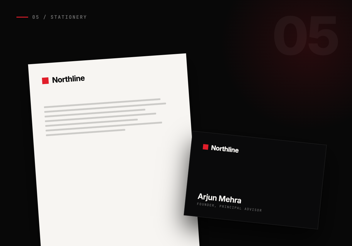
Letter, card, envelope on textured stock.
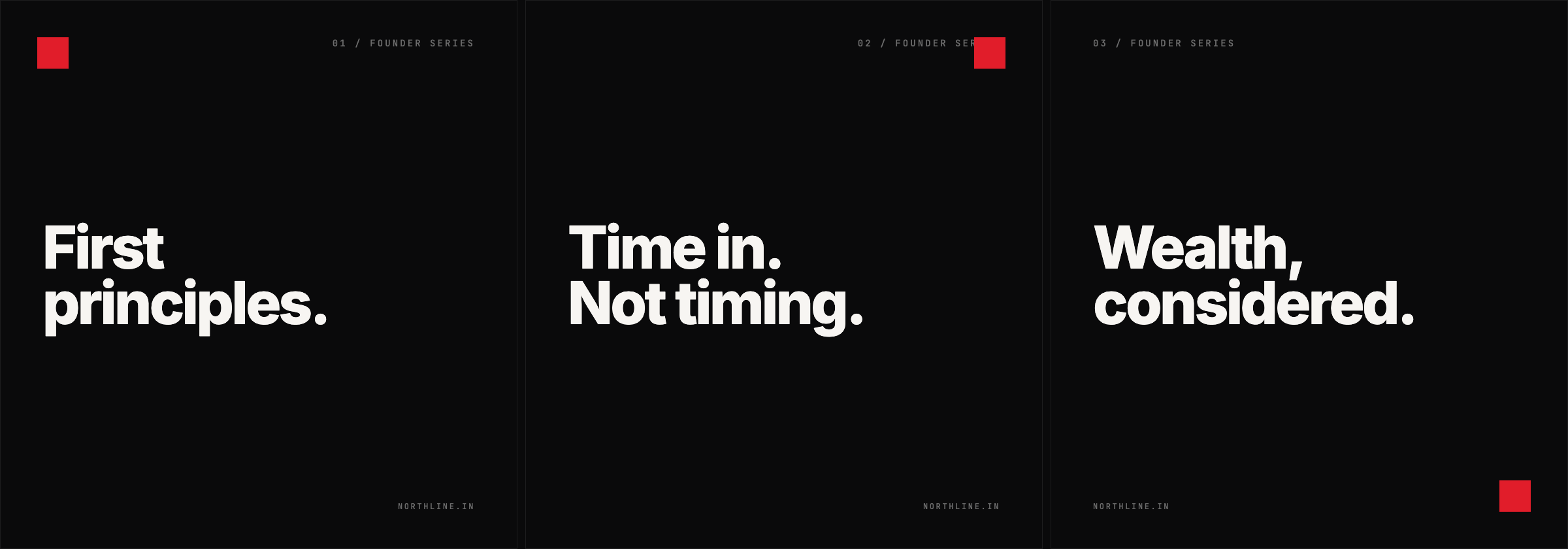
"First principles" series — three executions.
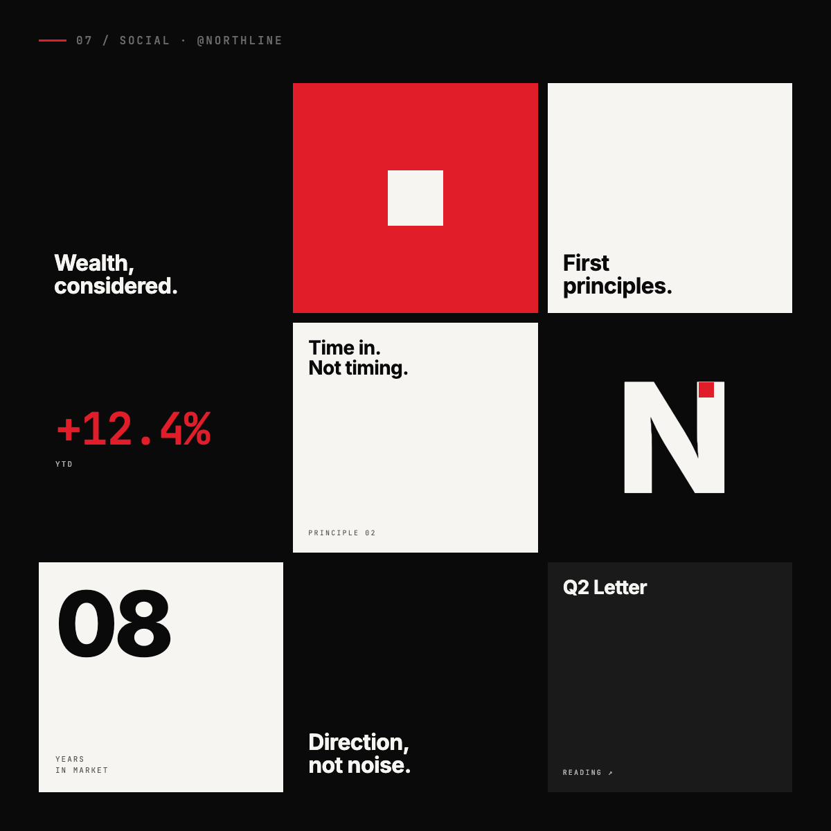
9-post launch grid for Instagram.
Premium welcome materials for new HNI clients.
From primitive grid to final mark.
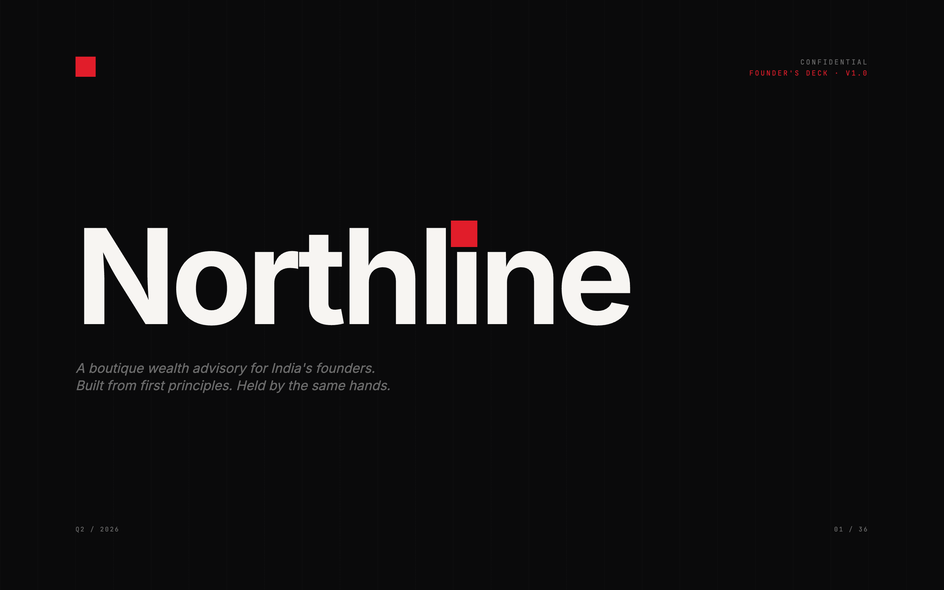
36-slide pitch document — cover spread.
Office signage, investor reports, client portal — montage.
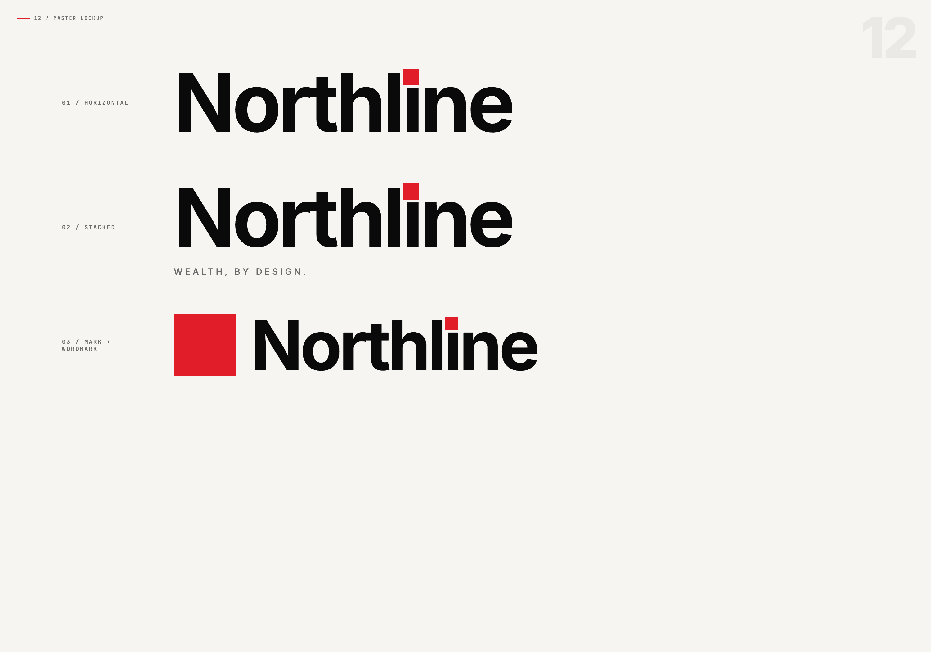
Horizontal + stacked variants, on cream.
Logo, mark, lockups, primary & secondary palettes.
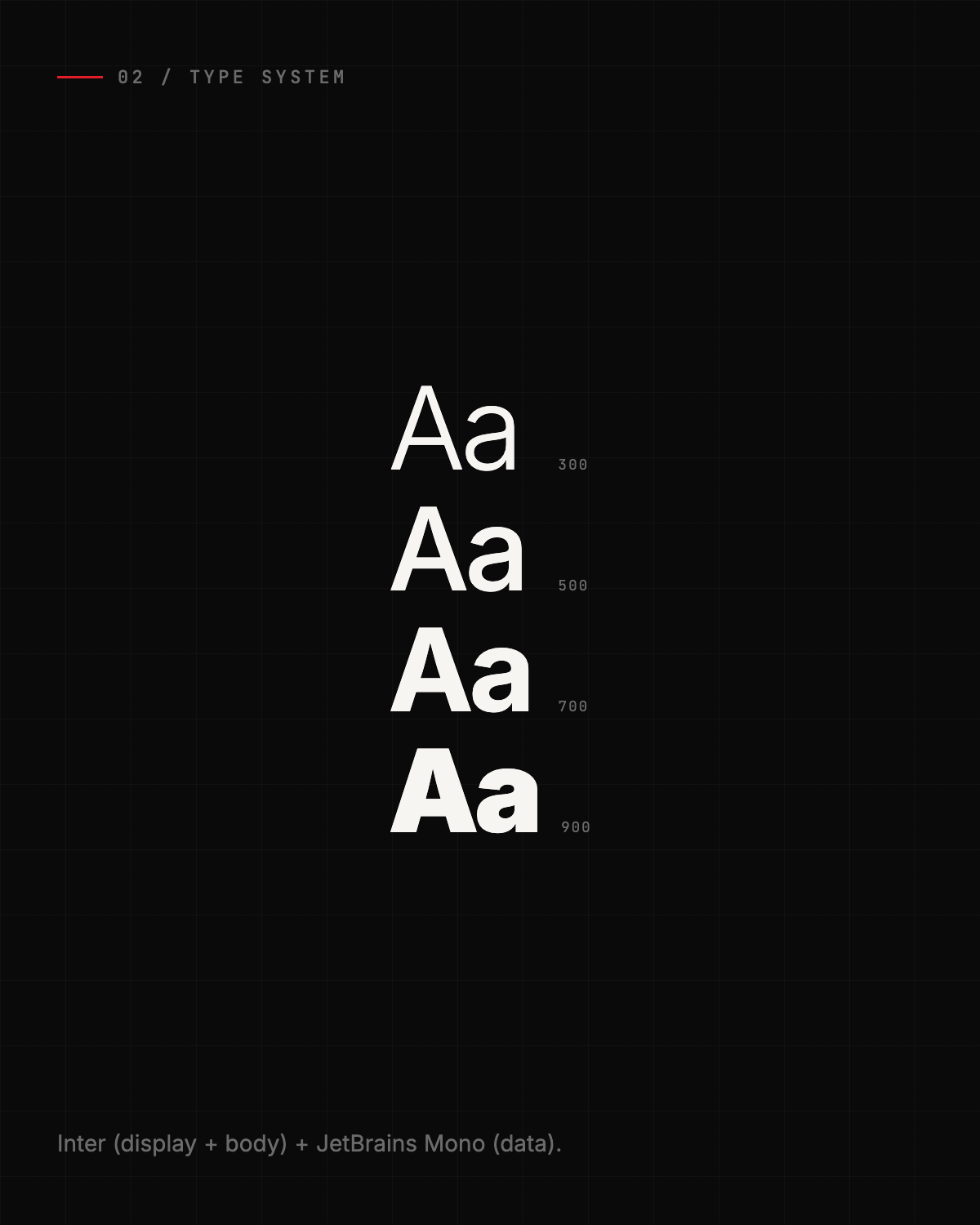
Display, body, monospace — across digital and print.
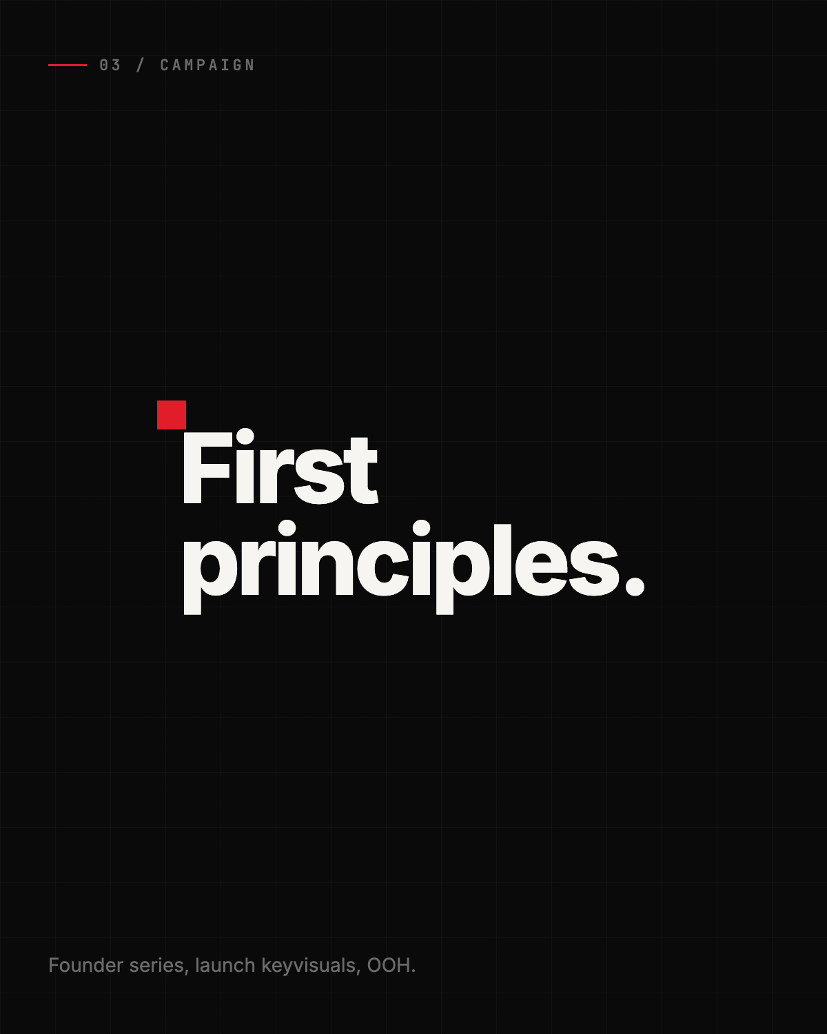
Launch keyvisuals, OOH, paid media creative.
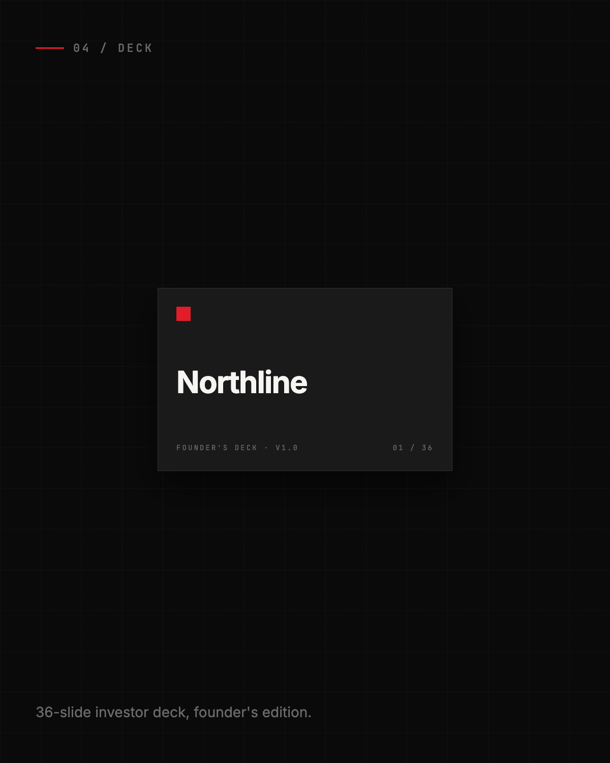
36-slide pitch document, investor-grade.
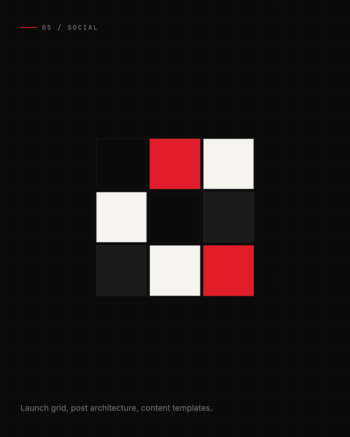
Launch grid, post architecture, content templates.
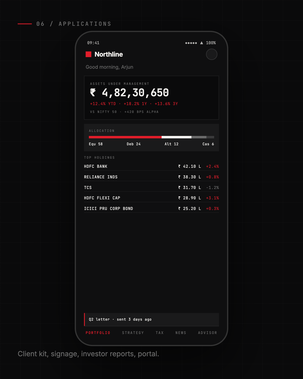
Client kit, signage, investor reports, portal.
We don't ship “a screen.” We ship the full system a wealth manager serves the principal with — portfolio, strategy, tax, news, advisor. Each tab researched against real Indian wealth-management practice, drawn in code, and locked end-to-end in-house.
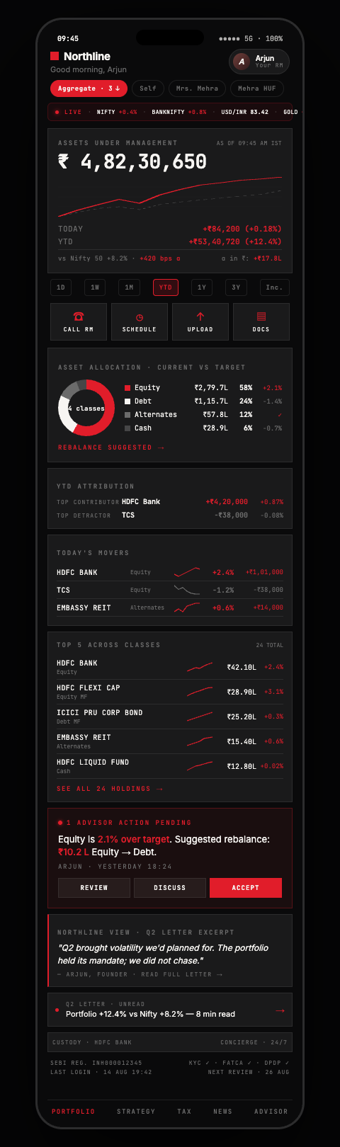
AUM, allocation, today's movers, top holdings with sparklines, Q2 letter chip.

Risk profile gauge, drift bands, rebalance trade preview, tax impact.
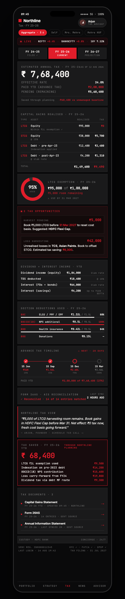
Capital gains by bucket, LTCG ₹1L gauge, harvesting, advance-tax timeline.
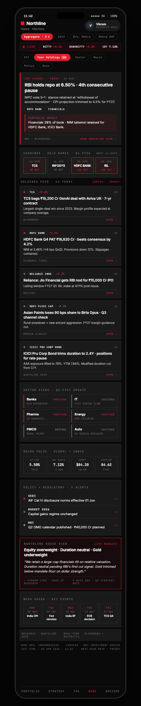
Holdings-aware feed, earnings calendar, sector views, quarterly house call.

Principal RM card, service team, meeting agenda, doc vault, family access.
Founder's note, single photograph, one feeling. We anchor on what the brand should evoke before we draw a line.
Sketches, references, mood boards. We narrow to one direction before we move pixels.
Identity, type, campaign, deck, packaging — all built in parallel by the same team. No vendor handoffs.
Applications go live. Brand book, social architecture, packaging shipped to client and partners.
Brief Tuesday, live Friday. They moved like one team.